Skip navigation

This project was a problem solving task set over the time scale of three weeks, when we were assigned this project we were told that for the first week we would be assessed as individuals by the ideas and research we could allocate for the next step to be assigned in the second week.

These were some of my ideas:


In week two of the three week duration we appointed groups and told to collectively combine our individual ideas to design and build only one drawing machine as a group.

Our randomly selected group organised by tutors Ed and Pete, consisted of the following eight people including myself:


Leeanne Wright
Thomas Pacheco
Steven Makuka
Tony Harrington
Omar Ahmed
Wonda Heywood
Courtney
Nathan


We started off by sitting around a large table, taking each others details, Names, Email addresses and phone numbers so we could contact each other to discuss our processes.

We then discussed our objectives, first one being a group name, which we finally came to a unanimous agreement, should be Mechanical Minds logo beings ‘M and M’s’, Mechanical because off the task at hand and minds because it is the combination off our minds in which we need to complete the best out come.

The second objective being a title for our machine and as our machine was designed to produce circles we wanted a fun and creative title for our machine, we debated between two names Circle Mania and Circle Fun, and finally come to an agreement with Circle Mania.

We then discussed what material would be need and how would it work, we made a quick sketch of the parts we that we may need:


I thought the best way of showing colours would be an image made of colours and as it was a drawing machine that i should use an image made up of drawing utensils.

This was the image i chose found using google search engine:

Using Adobe Photoshop tools i deleted the dark background as i wanted to inset as a layer an image relating to mechanical objects, I searched for this kind of image also via google and found this image:

I then merged down the two images to make one image and using filters and tools manipulated the image until i was satisfied then overlayed bold text and typography such as this letter,

to create this final image:

One task was designing using software such as Photoshop and using ideas from the rest of my group members we discussed our main target audience for marketing and also who would most need our project, as our design creates accurate circles anyone using stationary such as compasses would find our project very useful.


Another task was to design visual images to attract an audience to our machine. As a group we discussed methods of attraction, and decided that it would be through colour, I then thought of ways of representing colour whilst also relating to our group name and machine title.

The object of the machine was to have moving parts that create a clearly drawn images on either a vertical or horizontal sheets of paper.

The machine could work by itself or with an operator but to clearly be a ‘machine’ that crates clearly ‘drawn’ images.

We had to record everything that we had done throughout the process of creating our final outcome e.g.
drawings, Marquette’s, collages and early ideas.

In the earlier days of the second week we appointed individual tasks for each of us to brake down the work pressures but still came together to make any big final decisions.

The making of the final drawing machine was similar to the prototype miniature fan like version which we presented in the first week.


These are some of the parts used the third image to the right hand side is the combination of the two images on its left.

The preocess making of the machine did take a few modifications of the parts as you can see in the image.

This is how we tested the machine to  see if it was actually working as it should do, and as you can see it’s a success.

These images below are the result of CIRCLE MANIA!!!!!!!!!!!!!!!!

I Think these images are AMAZING but the next image is my favourite and shows the diversity of our machine.


Mikey Mouse Made by Mechanical minds CIRCLE MANIA!!!!!!!!!!!!!!!!!!!!!!!!

We thoroughly enjoyed this project and loved working with the people involed in accomplishing such a great result.

We were given a task in class to create an image or design of which a pound coin would be the subject. The design would have to represent a pound coin and ironically we actually had to all give in a pound and the people with the best designs would get a cash prize from the total amount given in.

For my design i wanted to not only put in some kind of typography the words PAY TO PLAY but also represent each word in its own idividual right, i knew that i wanted to use the pound coin in some form of a game, so i thought about games which have circular geometry so that i might be able to use the pound coin to replace the circles eg. a control pad button which was one of my first ideas but then i thought of an evan better idea.

My first idea

My first idea

To use pound coins as checker peices, and this then became my final image.

I first sketched the image of the pound checkers peices on the red and white checkers board and then in bubble writing underneath skeched the words PAY TO PLAY leaving out the letter ‘O’ in the word ‘TO’ as i wanted to using graphic software insert the image of a pound coin below, I then scanned the image onto a computer then inserted the image of the pond and edited slightly to make it look more proffesional.

For this project we were asked to create a collection of cd covers to that corrispond with eachother like a box collection. We were given a choice of multiple music peices to choose from to graphically illustrate using only Typography.


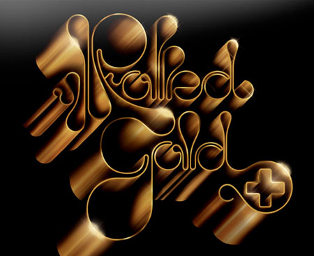
Alex trochut

topmwm_alex_trochutGraphic design is a competeitive industry constantly introducing new designers and and origional ideas, a designer who has succsessfully been recognised is Alex Trochut. He is an independent graphic designer who loves to create illustrations designs, and minipulate typography and lettering. From his studio in Barcelona Alex Trochut has a very unique stratigy  his designs as they are all so different and puts masses of effort in his work evolving from each project, and as a statement he believes in “more is more” and looking at some of his hectic designs where theres layers and layers of different subject matters he certainly does live up to that statement. He has been awarded Certificate of Excellence in Type design. Type Directors Club (New York, 2005), Art Directors Club Young Guns 6 Winner. (New York, 2008), Selected work for the Communication Arts Design Annual 49 (2008).
He has also worked for top clients including, Coca-Cola, NYTimes, The Guardian, The Rolling Stones, Channel 4, Nixon, Johnnie Walker, Sixpack France, British Airways and Nike.


He has created images that put a different perspective on typography and is very inspiring to up coming graphic designers opening the pathways for versitilty.

http://www.behance.net/trochut – 72k www.alextrochut.com/ – 3k –  

http://www.designioustimes.com/artist-of-the-week/alextrochut.html – 53k –

toy-story_01 

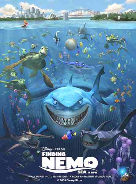
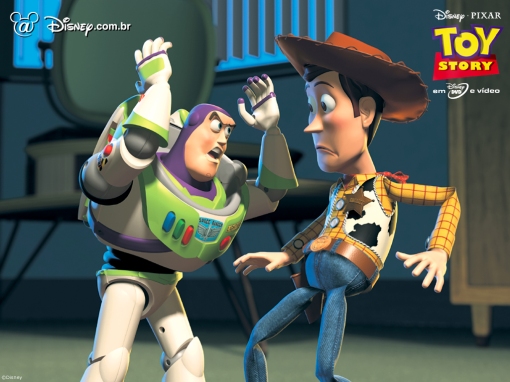
Graphic design  in many ways is evolviong, and as such there are vast amounts of designers who are striving and working on getting their skills of it better. One apllication of graphic design is animation. Animation is graphics in an evolved cartoon-like form. Many films are made using this graphic form. Film makers are employing this method commonly whereby true graphic work is produced. In particular director Lee Unkrich, is an American director and film editor. He started his career in 1994 as a film editor and moved on to directing big graphic animation such as ‘Toy Story’, ‘Monsters Inc’ and ‘Finding Nemo’. All these Big budget box office movies express and convey the true essense of graphic design at heart. Lee Unkrich furthermore expresses and conveys graphic design with a narrative and a set of lovable characters so viewers can enjoy watching graphic design at its upmost glorious state; motion picture. This graphic motion picture allows the influence of graphic design to come to life on screen and in our hearts. Lee Unkrich further enables that to happen with his graphical ideas and concepts. We as the audience and young designers alike can engage in his work an aspire to use his methods in ours.

 Finding_Nemo_poster_bruce_shark

en.wikipedia.org/wiki/Lee_Unkrich – 33k – www.imdb.com/name/nm0881279/ – 35k –

sak 

sakaguchibio_1Graphic design Is being used all over the world and as such it is being used by all companies in all forms of the media. One in particular, the Games industry. The games industry is using graphics immensely and as such, there are hundreds of games being made to this day. One game deisgner, Hironobu Sakaguchi is a famous designer. He was born November 25, 1962. He is a Japanese game designer, game director and game producer.  Within his school days he went on to study electrical engineering while attending Yokohama National University, but dropped out of the university. Furthermore in his life he went on to direct films as he directed Final Fantasy: The Spirits Within. This movie is an adaption of the epic and poular video game final fantasy. The movie was graphic-based meaning that he took full advantage of graphics and made the whole movie a full length animation. From this, Hironobu Sakaguchi was fully able to use his designing skills in graphics to create graphic wander within a motion picture.

Hironobu Sakaguchi is also responsible for making the Final fantasy games whereby he also expressed his graphic skill in creating a playable world of his creation.


 en.wikipedia.org/wiki/Hironobu_Sakaguchi


http://www.mobygames.com/developer/sheet/view/developerId,33334/ – 18k

matrix 

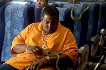
Graphic design is influencing major companies around the world and as such has influenced the movies business. Graphic design has influenced the movie business in such a way that it has become a part of it. From this, movie directors thrive on using graphic design within their movies. One of which is named David Richard Ellis. David Richard Ellis was born September 8, 1952 in Santa Monica, California. He is an American film director and a former stuntman. He further began his career in the film industry as a supporting actor in juvenile roles. 1975 was his big screen debut whereby he made a film titled ‘The strongest man in the world’. He switched for a short while to being a stuntman but later came back to making and assisting on films. He was in charge of the action sequences SNAKES_ON_A_PLANEfrom films such as The Matrix Revolutions, which is a somewhat a graphic-based movie exploding with digital effects and graphic animation. David Richard Ellis also directed the film ‘Snakes on a plane’ in 2006. This movie was based around the concept of snakes being set loose on a plane. The snakes were digitally recreated and put in the movie. David used the concept of digital subjects as an influence towards graphic design and enhancing his visual representaion within the movie.

 http://www.imdb.com/name/nm0254786/ – 54k – CachedSimilar pages 


en.wikipedia.org/wiki/David_R._Ellis – 29k – CachedSimilar pages

http://www.denofgeek.com/movies/23983/den_of_geek_loves_david_r_ellis.html –

Graphic design as an influential art form is constantly being modified to its boundaries. Designers and film makers use and explore it continuously. One of the many was a Chinese director named Ronny Yu Yan-Tai. Ronny Yu Yan-Tai is a director, producer, and movie writer. He was born in Hong Kong and graduated from Ohio University. Within his movie career he was once attacted to direct Snakes on a plane but was unfortunately replaced by David R. Ellis.

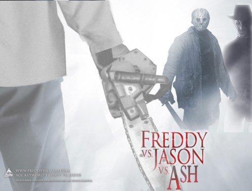
Furthermore he was not defeated by this outcome and moved on to directing the graphic epic movie ‘Freddy vs. Jason’ in 2003. This movies main characters centured around Freddy Krueger, a deranged deceased serial killer who when invited by the fear of childrens nightmares, murders them. Graphic-wise the sereal scenes involving him are carryed out using graphic softwares to enhance the all out effect of his character. In addition the designing of his character was also carryed out graphically.

Jason is another central character who he manipulated by Freddy ti kill others. These two characters were graphically designed first before through their new look in order to have the casts ready for shooting. Moreover this is the influence of graphic design in movie making.

 freddy_vs_jason

en.wikipedia.org/wiki/Ronny_Yu – 33k –


http://www.imdb.com/name/nm0950553/ – 43k –

spider-man-1Graphic design is a subject that has played a key role in movie making but certain movies over the last century have influenced the development in graphics, one man who helped show the potential that graphic design has in movies is director Samuel Marshall “Sam” Raimi. Moreover Sam Raimi was born October 23, 1959, he is an Americanfilm director, producer, actor and writer. He was raised in conservative Judaism, and his ancestors immigrated from Russia and Hungary.

Furthermore within his years of growing up he became fascinated with making films. His passion stemmed from when his father oneday brought home a video camera and with his childhood friend Bruce Cambell, he began to make movies of his own with

Super 8 mm film which is a motion picture film format released in 1965 by Eastman Kodak.

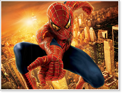
In his later years, 2002 to be exact his most famously recognised film, Spider man was released and became a Block buster extraviganser.

Spiderman as a movie consisted of a lot of graphic animation whereby Raimi wanted to express the motions of spiderman in such a way that he felt was best done graphically. Through this he could manipulate spidermans movements in such a way that wouldn’t be considered humanly possible, all through the process of graphic animation.  Spiderman4

 http://www.imdb.com/name/nm0000600/ – 72k –


en.wikipedia.org/wiki/Sam_Raimi – 83k

icon_semioticsSemiotics is a very important process in influential reference to graphic design, Semiotics its the study and sign processes when conducted individually or in groups of data and it enables us to analyze and understand the meaning of format of signs, patterns and symbolism and its important that we understand a creation before we interact with it a sign can be anything from a word, a sound, or a visual image.

Semiotics is very important in the development of graphic design especially in the visual communications of signs and their meanings, it’s something we have subliminally learnt to understand an example of this is road signs, or independently learnt such as sign language.ASL

Government also uses semiotics in the same way it is used in marketing and sports strategies by having hidden tactics to gain an upper advantage on the competition.

A word can transmit a meaning only within the language’s grammatical structures and codes. Codes also represent the values of the culture, and are able to add new shades of connotation to every aspect of life. Many symbols can represent the same word but its how it communicates with the majority of its audience that determines how successful it works to project its meaning.


en.wikipedia.org/wiki/Semiotics – 91k –

www.semiotic.co.uk/ – 6k –